Exploratory Data Analysis of Magic: The Gathering Cards

Loading
Sorry, something went wrong. Reload?
Sorry, we cannot display this file.
Sorry, this file is invalid so it cannot be displayed.
view raw MTGEDA.ipynb hosted with ❤ by GitHub

I’ve been a pretty avid Magic: The Gathering fan since high school and I recently came upon a great source of JSON files of what appears to be every single MTG card and set ever printed (here) so I couldn’t help but do an exploratory analysis of this data to see what kind of insights I could come up with just based on some questions I had.

Initially, my data didn’t have a release date for any of the cards on it, but I used a handy SQL query (also helpful for cutting out a bunch of columns that were either not useful for me or contained outdated or depreciated information) to join this data with a set that contained the release date for each set so I could have release date information for each card. The SQL query used can be found here.

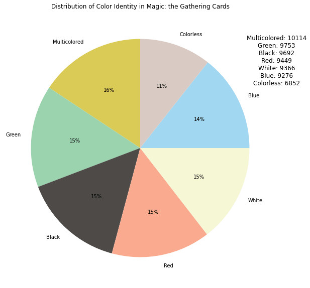
When going through this data I learned quite a bit and found some of my assumptions were true and some were way off. For instance, I took a look at the distribution of “color identity” among cards and found that, while I was right that the colors are fairly evenly distributed, the difference between the most populated single color (Green) and the least populated single color (Blue) was only slightly less than 500 cards over the course of almost 30 years of Magic. You can see the pie chart I made illustrating this below.

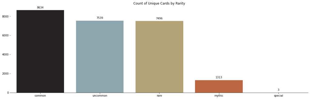
However, regarding card rarity, I was very wrong about my initial assumption. In Magic: The Gathering there are 4 major card rarities: Common, Uncommon, Rare, and Mythic Rare. I initially assumed that as cards became more rare, there would be a lot fewer of them printed. This is pretty dead-on regarding Mythic Rares (though the first Mythic Rares weren’t printed until 2008, roughly 15 years after Alpha released), however the differences between Commons, Uncommons, and Rares are actually a lot smaller than I initially assumed. A plot I made illustrating this can be seen below.

But this is all only scraping the surface of what there is to know and learn about Magic: The Gathering as a game, so for these insights and more, make sure you check out the whole EDA and stay tuned for more!

Exploratory Data Analysis of NYC Taxi Data

Loading
Sorry, something went wrong. Reload?
Sorry, we cannot display this file.
Sorry, this file is invalid so it cannot be displayed.

Another quick exploratory analysis of NYC Taxi data. Once again a project from the 3rd course of the Google Advanced Data Analytics Professional Certificate.

In this one I was asked to create a map of New York City taxi trips in Tableau which was a fairly interesting endeavor. I didn’t have any geographic data given to me in the project, so I had to go gather it myself from here.

The Omega Protocol (Ultimate) Damage Done Dashboard

Back with another Final Fantasy XIV dashboard, this time for the most recent (and quite difficult) encounter, The Omega Protocol (Ultimate).

I started out this one by using GraphQL to collect data through the FFLogs API and imported the data into Google BigQuery. I ran a few SQL queries to preprocess the data (the queries in question can be found here on GitHub) and once again used Looker Studio to create an interactive dashboard with the query results.

As this is an encounter with multiple phases, I added a dropdown control menu to select which phase(s) to filter the results for.

The dashboard also includes “drill down” buttons that can be used to modify the table or pie chart to display the damage done for each individual ability rather than by each player.

Making use of the drill down buttons and the phase control, we’re able to highlight individual players and neatly chart the damage dealt by each ability for a particular player in any phase of the fight.

You can access the full dashboard here.

Dragonsong’s Reprise Damage Taken Exploration

Loading
Sorry, something went wrong. Reload?
Sorry, we cannot display this file.
Sorry, this file is invalid so it cannot be displayed.

Hello! What I have here today is another look at the same Dragonsong’s Reprise (Ultimate) clear from Final Fantasy XIV, but this time it’s damage taken. Rather than just clone the same boring dashboard from before, I wanted to do a bit of Python work so I did a bit of a dive into the data to see if I could figure out anything interesting. Some of what I discovered surprised even me, and I was there for it!

Please take a look and as always you can find this project on GitHub as well.

Final Fantasy XIV Data Studio Dashboard

Dashboard created using Google’s Data Studio tool for the purposes of visualizing data gathered through my group’s clear of the Final Fantasy XIV raid Dragonsong’s Reprise (Ultimate).
Data was gathered through the use of the FFLogs API and uploaded onto a Microsoft SQL Server. I took the relevant data from there and uploaded it to Google’s Data Studio and created the resulting dashboard.

Link to the dashboard.

Old School Runescape Hiscores

Loading
Sorry, something went wrong. Reload?
Sorry, we cannot display this file.
Sorry, this file is invalid so it cannot be displayed.
view raw boss-kc.ipynb hosted with ❤ by GitHub

Python exploration of Old School Runescape Hiscores data gathered on July 21st, 2022.
Two small projects here:

1. Boss kill count tracking for one particular username. When executing the code, the user is prompted for a case-sensitive OSRS username and then they are given a table of information including all bosses and that user’s kill count for that boss (or a “Not listed on Hiscores.” response if the kill count is too low to be registered).

2. List of all bosses with the username of the player who has the highest kill count for that particular boss as well as the number of kills that player has.

I’ll likely come back to this in the future to add more as I come up with ideas for what I want to see.

Check out the notebook on Kaggle or GitHub.